

Illustrations by Pablo Aulandell.
Published by Conversation Tree Press.
The Garden of Forking Paths is the sixth title in Short Stops, a series from Conversation Tree Press dedicated to bringing exceptional shorter works of fiction to life through beautifully bound, letterpress-printed, limited editions that begin shipping immediately upon announcement.
Few have done more with the short story than the Argentine writer Jorge Luis Borges. In pieces sometimes no more than a few pages long, he created labyrinths, infinite libraries, and entire imagined worlds. His stories remain among the most influential works of twentieth-century literature.
First published in 1941 as the title story of El jardín de senderos que se bifurcan and later collected in Ficciones, The Garden of Forking Paths is among Borges’s best-known works.
Set in England in 1916, during the First World War, it follows Yu Tsun, a Chinese spy working for Germany, who has a secret to deliver to Berlin and a pursuer close behind. Caring nothing for a “barbarous” Germany, he means to prove to a superior wary of his race that a man like him can strike a decisive blow for its armies. His flight leads him to a scholar’s house in the countryside, where he once more encounters a puzzle left behind by his own ancestor.
It is a detective story, by Borges’s own account, but also a meditation on time, not as a single line, but as an infinite number of possibilities, all unfolding at once.
Pablo Auladell’s artwork, rather than capturing specific scenes in sequence as our illustrations usually do, forms what he calls “a visual envelope for the story.” Glimpsed as though in a dream or through a mirror, his three drawings expand on this concept of non-linear time and serve as the perfect complement to Borges’s text (more from Pablo below).
Tony’s roots are in Guyana, so it’s a particular pleasure to publish a writer from closer to home.
N.B. This is the first of three Borges titles we’ll be publishing as Short Stops, with the other two following in 2027. All three share a common design language (marbled paper patterns, typography, text paper, etc.) and all feature artwork by Pablo Auladell. As Short Stops do not come with rights, ordering this edition doesn’t reserve a copy of the next.
The Garden of Forking Paths is a limited edition of 500 unnumbered copies. A brief overview of the edition, with additional details below:
Artwork: Pablo Auladell has contributed three pieces of artwork, printed separately and individually tipped in by hand.
Typography: Interior design and typography are by Tony Geer.
Letterpress printing: Scott Vile at Ascensius Press printed the edition in Maine, United States, on watermarked Hahnemühle Biblio 150gsm mould-made paper, the most luxurious paper we’ve used on a Short Stop.
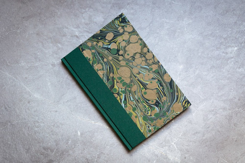
Binding: Quarter-bound in book cloth and custom hand-marbled papers by Jemma Lewis. The endpapers are GF Smith Colorplan with a linen finish.
Format: The books have a trim size of 6in × 9in and 32 pages including front and back matter.
Signatures: All copies are signed by the artist.
Illustration Placement
Each illustration has been printed separately and tipped into the book block by hand. Tipping in by hand gives us complete freedom of illustration placement—each one can sit against any page in the book, allowing it to be placed exactly where we need it to be.
Custom Hand-Marbled Paper by Jemma Lewis
The hand-marbled paper for this edition was created by Jemma Lewis. We worked with Jemma to create the marbling for all three of our Borges Short Stops at once: the same pattern throughout but with a different colour for each title. Each colour matches the second colour of that book’s letterpress printing, used on the title page and for shorter passages of text.
Hahnemühle Biblio 150gsm Paper
Hahnemühle Biblio 150gsm paper is a luxurious mould-made paper from Hahnemühle FineArt GmbH, a paper company founded in Germany in 1584, and one that we would typically use on a Lettered or Deluxe Edition. Each sheet features the iconic rooster watermark.
Typography
The title is set in LTC Goudy Thirty, a typeface that began life in 1942, when Frederic Goudy drew it for a commission that never went ahead. Lanston Monotype suggested releasing it after his death, naming it for “-30-,” the mark journalists used to signal the end of a story. Goudy died in 1947, and the typeface was finally released in 1953.
The text is set in Borges, a typeface designed by Argentine type foundry PampaType as a tribute to the work of Jorge Luis Borges.
Letterpress Printing
The text of the edition was letterpress printed at Ascensius Press on Hahnemühle Biblio 150gsm paper, giving each page a rich, tactile feel.
Under the direction of Scott Vile, the Ascensius Press offers book design, letterpress printing, and production coordination services, working with authors, publishers, and libraries. They publish their own letterpress editions, and design and produce letterpress and offset works for many preeminent private libraries.
- authors_list:
- Jorge Luis Borges
- artists_list:
- Pablo Auladell